Launching a new product for your business is an extremely exciting time, but it’s also a lot of pressure to make sure you get it right.
When it comes to introducing your product to your customers, it’s all about making sure they’re excited and drawn into what you have to offer but presenting yourself in just the right way that makes them want to connect further.
It’s a fine balance to try and achieve, but every business has to do it at some point. With this in mind, today we’re going to take a look at ten fantastic examples of businesses around the world and what templates and examples they have to offer, as well as detailing what we can learn from them.
Let’s just right into it!
1. Havenly – The Something New is Coming Email
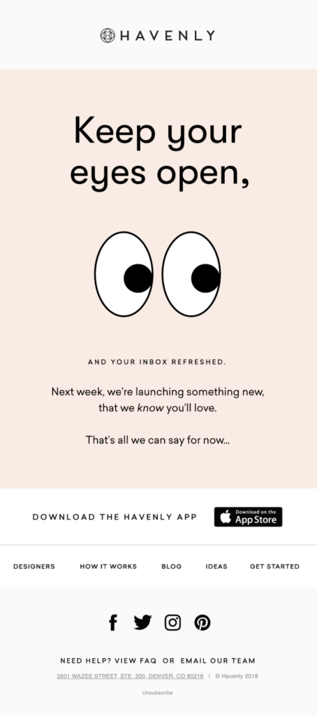
In your new product announcement email, the first launch emails you want to be sending out to your customers are ones introducing that something new is coming, but without actually telling them what it is. This helps to build anticipation and excitement for your product, and makes people want to know more. Havenly does an excellent job of this.
The email they sent out is clean and easy and it instantly makes you want to learn more. The fact that there’s no click-through anywhere on the email is also a nice touch, because you either have to be proactive in heading over to the website yourself, or just waiting. It piques the curiosity of their readers in such a great way.
2. Starbucks – New App Email
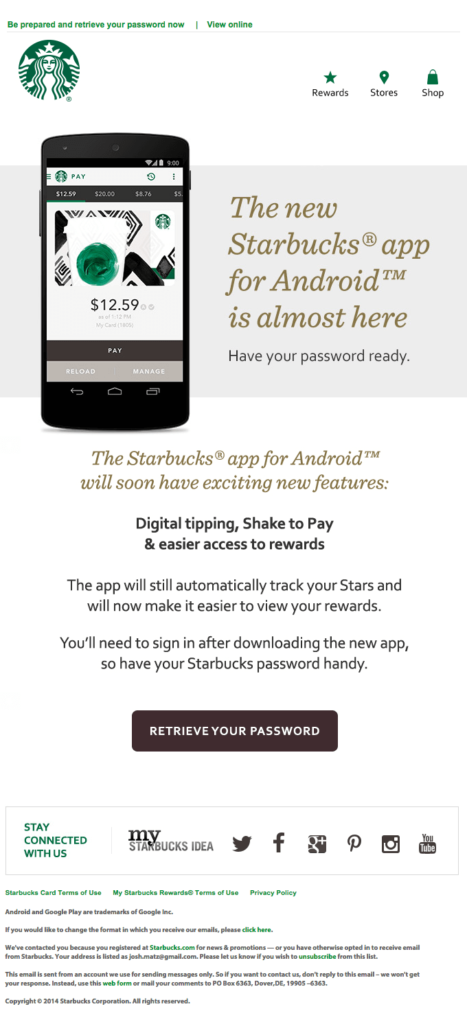
Starbucks’ new product announcement email is a great example of how to include a ton of helpful information in a single email but make it easy to navigate and not too overwhelming.
This particular email is about their new app launch and contains nice graphics and screenshots which introduce the product and make it clear on features, but there’s also clear text if people want to learn more.
All download links are found at the top of the page, so any die-hard Starbucks fans that are obviously just going to download the app can do so straight away, and overall this is just a smooth email that effectively gets the job done.
3. Massdrop – What You Wanted is Here Email
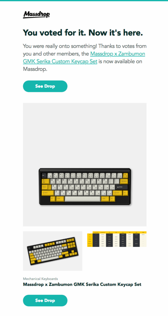
I really like what Massdrop have done here, especially with their opening line because it’s clear they have carried out a survey or competition to find out what their customers wanted, and now they’re being proactive in delivering what they said they would.
This is an instant attention grabber for customers who were involved in the voting process and will instantly grab their attention.
Looking into the email itself, you’ll see it’s very clean with nice graphics, but since the customers already know what this product is, because they voted for it, the CTAs are plentiful and clear, making it easy to convert into sales.
4. Casper – Meet Our New Product Now
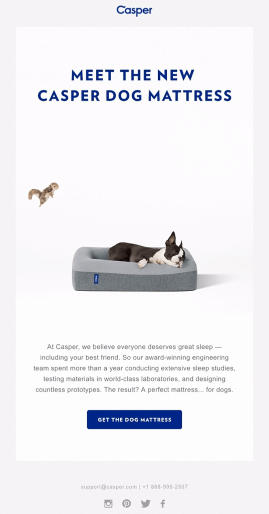
I really like the personal touch that Casper’s has gone for here. The main header at the top uses such personal language because when you’re talking to dog owners who tend to love dogs, of course they’re going to want to come and ‘meet’ whatever product is coming out. It’s powerful language that really resonates with dog owners.
You might notice the squirrel on the middle-right of the email, and this is actually a GIF that goes from side to side, adding a visual movement element to the email.
Personally, I’m not really sure of the point or purpose, but it does grab your attention and makes the email a bit more fun and engaging.
5. Harry’s – It’s Coming Email
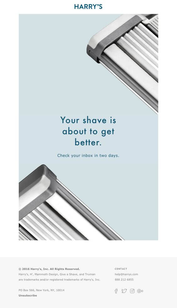
Harry’s is a really powerful example of a product hype email. It nails the subject line with the simple ‘It’s Coming’, and while it’s not as ambiguous as the Havenly email we spoke about first, since Harry’s produces shavers and razors, so it’s pretty obvious what’s coming, it still pikes that level of excitement.
The email is very direct in the sense that it tells you to check your email is exactly two days, the imagery is crystal-clear and minimalist, and the whole experience of opening the email and seeing such clean content is a real treat to the eyes.
6. Dr Martens – New Product Email
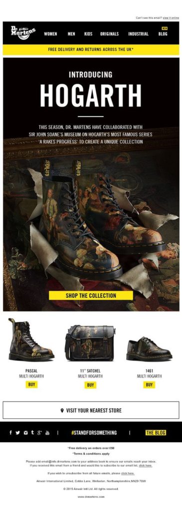
Dr. Martens has always been good at integrating art and fashion together, and this new product launch email template is a great example.
You can clearly see the boots as though they’re on display, like a work of art may be, making the boots look luxurious and tempting, which is great way to make people want to be a part of this and get their own.
This is a really seamless, clean, and gorgeous experience that doesn’t jump too much on information, but rather goes hard on the visuals.
7. Nintendo – The New Game Guide Email
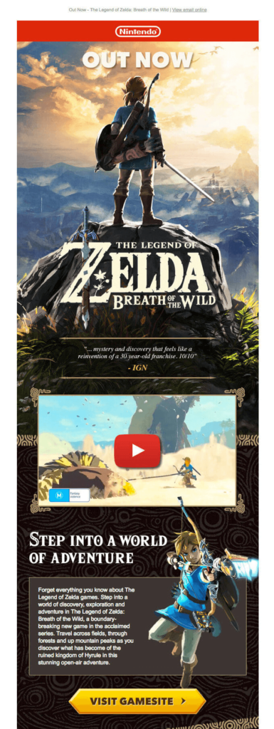
Easily the longest email example on our list today, this game release email is highly visual and properly caters to its audience that wants to see the graphics of this game and almost be taken on a journey themselves into what the game has to offer.
All the gorgeous imagery, of course, reflects what people are going to see in the game, so the more imagery they’ve included, the more it’s going to draw people in.
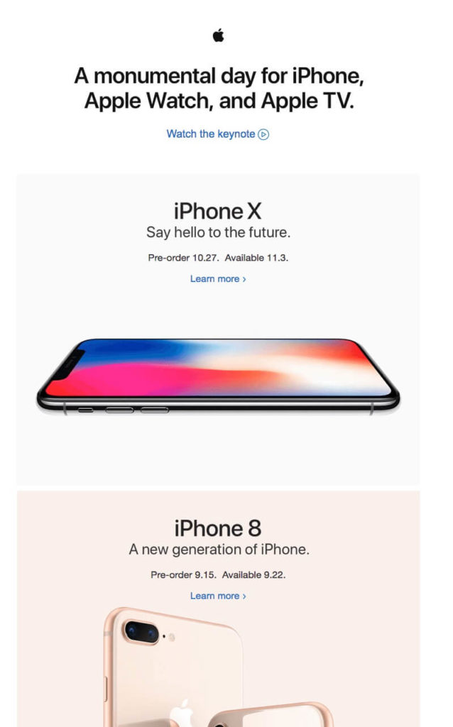
8. Apple – The Visual Email
9. Carbonmade – We Have Arrived Email
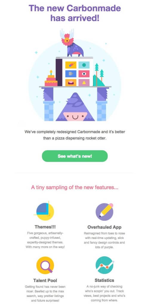
There’s no denying this Carbonmade launch email is incredibly fun and inviting to look at.
It’s a very positive design that uses a column section that highlights the key points of what a reader needs to know using fun graphics and cartoons and detailed points to help everyone learn everything they need to know.
This email is easy on the eye, which is great for readers, and it’s super scannable while containing a lot of information which is key to this email’s success.
By using a mixture of graphics and headers, readers can quickly scan to see if anything jumps out at them and makes them want to read on. The tone of voice is also a really nice touch.
10. Brother Moto – Launching Competition Email
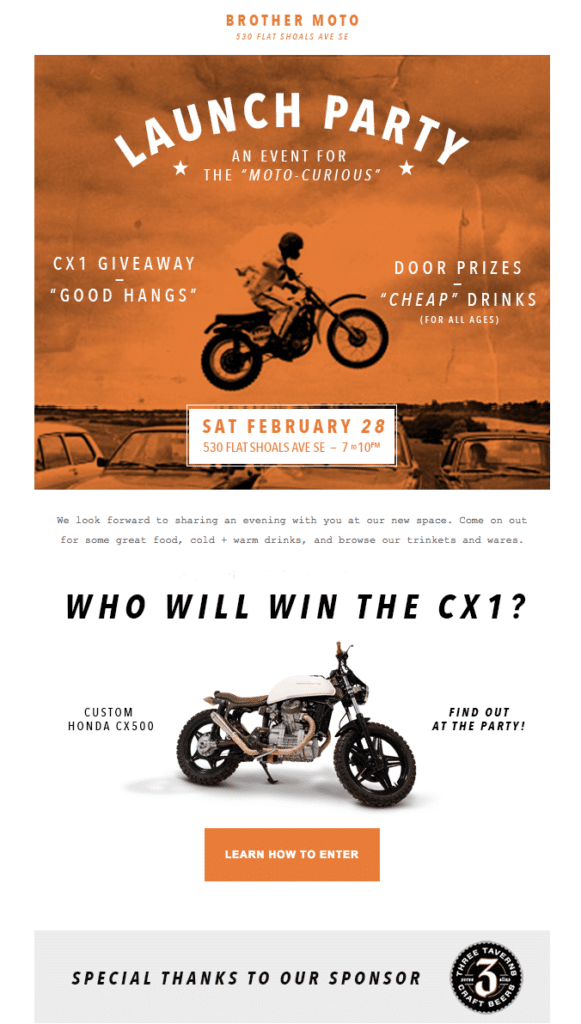
If you’re looking to market an event via email, this is a fantastic email from Brother Moto that’s ideal to refer to.
The key point here is the fact the company was running a giveaway competition and have made this very clear in the email; so much so it’s the highlight point.
This grabs your attention and makes you want to know more, because of course if you’re signed up to these emails then getting your hands on this motorbike is something you’re going to want.
The call to actions and colours schemes are also handled particularly well.
